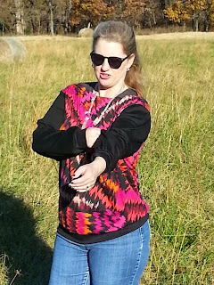
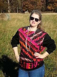
It didn't turn out quite like I'd hoped...
This top was pictured in the magazine like so:
Flashdance flashback anyone?
It was also pictured in plaid fleece with light contrast sleeves and hem band:
Both versions look like loose, easy pieces that could easily be paired with jeans or a skirt... or (ahem) leather shorts.
I made a straight size 44. I really should have gone down to a 42 at the shoulder, but I figured it wouldn't make a whole lot of difference.
It turned out huge. This thing swallows me. The sleeves are too long, and the neckline is way too wide. I feel like I'm swimming in this.
Funny thing is, though, it really looks like it was designed that way:
Size issues aside, this is a very easy, straightforward pattern. There are only 5 pattern pieces including the wrist and hem bands, which are rectangles with measurements provided.
The front and back are nearly identical- the front neckline is just slightly lower than the back.
I used a printed ponte from Fabric.com for the front and back, and black ponte from Hancock Fabrics for the sleeves and bands. The print fabric is very light and soft and doesn't have quite as much body as the black fabric. I think it's almost too light for this project. A little more body may have helped this over-sized design.
Grrrrrr... I'm just not happy with this. Looking at the pictures, I wonder if it's even worth cutting it apart and trying to reduce the top. I could kick myself for not making a muslin and figuring out that there were problems, but I thought how could a simple sweatshirt go wrong?
The back doesn't look so bad. Well, except that the sleeves are still too long.
What could possibly make this top look better?
I know, pairing it with a 2014 Corvette Stingray convertible! Sadly, the car is not mine. It's just a fun shot of the top "on location."
I still want a fancy sweatshirt and I'm not going to let this pattern defeat me. I'm going to try again with Simplicity 1317 and a different design:
I already have a red and black textured knit picked out for view C. I think I will like the raglan sleeves better and the neck band on this pattern looks like it will be more comfortable and flattering.
I will have to think some more about 09-2014-114. Maybe I will take it apart and re-work it. We'll see...


4 comments:
I think you are right that it is designed that way. Either embrace the "Flashdance" vibe (complete with the car!), or do you think you would have enough of the print to recreate the raglan sweatshirt with plain black sleeves and neckband?
I like the Simplicity pattern and just purchased it myself. Sorry your Burda one came out so big!!! Look forward to seeing your next version.
I really like your fabric combination! And it looks awesome in that car! I would try to save it if it's not too much work. I often have the same issue with wide neckline patterns. I usually have to redraw the neck to get them to stay on my shoulders.
What about wearing it to sleep in? Lately I have been wearing a giant sweatshirt to bed with a long sleeved t-shirt underneath. Just an idea!
Post a Comment